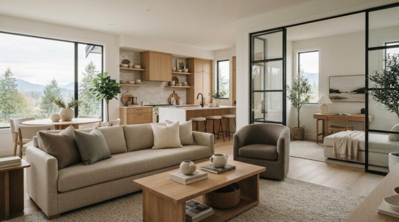
Home Staging Colour Palettes 2026: A Practical Guide
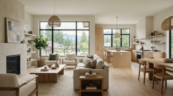
What if the most current colour choice for a listing isn’t a dramatic feature wall, but a warmer, more considered neutral? Sellers often want a home to feel fresh without asking buyers to look past a highly personal scheme. That’s the balance at the heart of home staging colour palettes 2026: use nature-inspired greens, earthy tones and deeper accents selectively, while letting the home itself lead.
A palette that looks beautiful online still needs to work with a room’s natural light, fixed finishes and architecture. This guide explores colour directions to consider, then shows how to adapt them into a cohesive, welcoming backdrop that photographs well and feels comfortable in person. You’ll learn where a restrained accent can add depth, when a quieter neutral is the better choice, and how furnishings and décor can introduce colour without permanent changes. A pre-listing consultation can help identify which adjustments will make the clearest difference before photography and showings.
Key Takeaways
- Use home staging colour palettes 2026 as inspiration, not a room-by-room rulebook. Choose accents that support the home’s character.
- Check how undertones and the direction of natural light affect a colour before settling on a palette.
- Compare warm neutrals, muted greens, softened blues and earthy accents with your finishes and the impression you want each room to make.
- Build a cohesive scheme room by room: assess fixed features first, sample colours, edit, then carry the palette through connected spaces.
- Thoughtful staging can coordinate existing furnishings with selected rental pieces, textures and colour accents for a considered presentation.
2026 Home staging colour palettes: what’s changing
A colour trend is a signal to explore; a staging palette is a considered response to a particular home. A shade that feels fresh in a paint forecast may clash with existing flooring, cabinetry or the quality of light in a Canadian home. Treat warm neutrals, muted greens, softened blues and earthy accents as options to assess, not rules every room must follow.
For a listing, colour should support the home rather than compete with it. A calm, cohesive backdrop helps the eye take in a room’s proportions, natural light and architectural details. A buyer-friendly staging palette is a restrained, connected mix of colours that lets the home’s features stand out while still feeling welcoming. Understanding basic colour theory can help explain how hues relate, but the right combination depends on the finishes and light already in place.
Which colour directions are worth considering in 2026?
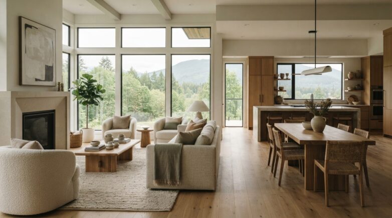
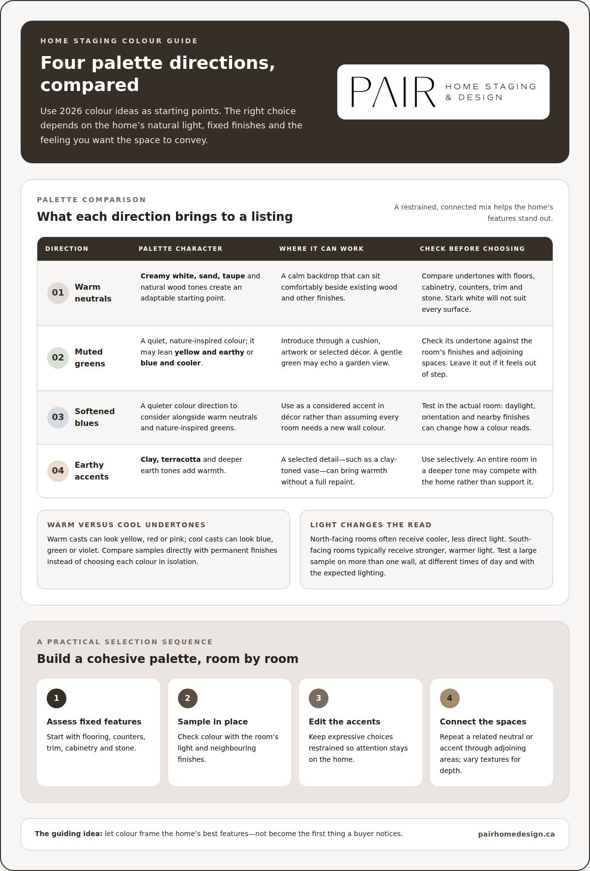
Warm whites and layered neutrals make adaptable starting points. Try creamy white with sand, taupe or natural wood tones rather than assuming stark white will suit every surface. Muted greens and softened blues can bring a quiet connection to nature through a cushion, artwork or selected décor. Clay, terracotta and deeper earth tones add warmth, but are usually best introduced selectively rather than applied automatically to an entire room.
These are options to test against the home, not a single palette that will suit every property. A warm neutral may sit comfortably beside existing wood, while a gentle green could echo a garden view. If a colour feels out of step with the fixed finishes, choose another accent or leave it out.
Why staging palettes differ from personal decorating
Personal decorating can celebrate a favourite saturated colour, collected objects or a distinctive feature wall. A listing presentation has a different purpose: it should feel inviting to a range of viewers and keep attention on the home. That doesn’t mean creating a blank, characterless interior. It means editing expressive choices so they add warmth without becoming the first thing a buyer notices.
Repetition creates flow. Carrying a related neutral or accent from an entry into a connected living area can make the transition feel intentional, while varied textures keep the scheme from feeling flat. A trend can inspire one considered detail, such as a green throw or clay-toned vase; it doesn’t require a full repaint. Pair Home Design’s staging approach combines existing furnishings with selected rental pieces and colour accents to create a cohesive presentation around the home.
Begin with what’s already working. When the palette respects the home’s finishes and architecture, colour frames its best features rather than distracting from them.
How undertones and natural light shape home staging colour palettes
A paint colour has two things to consider: its overall lightness or darkness, and its undertone. Lightness describes how pale or deep it looks. The undertone is the subtle cast beneath it, often warm (yellow, red or pink), cool (blue, green or violet), or closer to neutral. Two light beige samples may look alike on a paint card, yet one can read creamy beside a warm wood floor while the other looks pink or grey.
Undertones become more noticeable beside permanent finishes. Hold samples near the flooring, counters, trim, cabinetry and stone in the room where they’ll be used. A grey with a cool blue cast may feel at odds with golden oak; a warm white may appear yellow beside a crisp white countertop. Compare samples together in place instead of choosing each colour in isolation.
How to read warm, cool, and neutral undertones
Look for the colour beneath the obvious colour. A muted green may lean yellow and feel earthy, or lean blue and feel cooler. A white can appear creamy, pinkish or faintly grey. Place candidate samples directly against existing finishes, then step back to see whether they sit comfortably together. In adjoining rooms, related undertones can connect the view from one space to the next without making every wall identical.
How to assess colour in changing light
Room orientation affects the quality of daylight. North-facing rooms often receive cooler, less direct light, which can make some colours appear subdued or chilly. South-facing rooms typically receive stronger, warmer light, which may intensify colour or bring out yellow and red undertones. Neither condition automatically rules out a shade; it changes how the colour reads. In the Fraser Valley, where daylight and weather can shift, testing samples in the room is especially useful.
One paint sample can look different from room to room because each space has its own orientation, surrounding finishes and mix of natural and artificial light. Test a large sample on more than one wall if possible, and view it in the morning, afternoon and evening. Check it with the lights you expect to use, then consider how it may appear under the lighting used for listing photographs.
Take time before committing. A quick check can prevent a shade that looked balanced in one corner from feeling unexpectedly cool or bright elsewhere. A pre-listing home consultation can help assess colour choices alongside the home’s finishes and presentation.
Compare 2026 staging palettes by room, finishes, and buyer impression
A palette that feels balanced in one room may not suit another. Flooring, cabinetry, window light and views into adjoining spaces all shape the result. Use the combinations below as starting points for home staging colour palettes 2026, then judge each against the home’s existing features. They’re practical options, not formulas or claims about what every buyer prefers.
- Warm neutral: A useful backdrop for living areas with wood floors or warm-toned furnishings. Cream and beige can look flat if they dominate without varied textures.
- Muted green: A measured accent for living rooms or bedrooms, especially when natural tones already appear in the space. Check its undertone against nearby finishes to avoid a clash.
- Softened blue: A gentle option for bedroom textiles or a small accent where cool-toned details are already present. In a dim room, it may feel colder than intended.
- Neutral with earthy accents: Introduce warmth through cushions, artwork or décor. Use deeper earth tones and terracotta selectively so they don’t take over the room.
Use these combinations to narrow your options, not to assign a colour by room name alone. A warm neutral may complement honey-toned flooring, while the same shade could look too yellow beside a cool counter. Light also changes how a colour reads: a soft blue that appears gentle by a bright window may feel more pronounced in a shaded corner.
Which palette works as a living room backdrop?
Start with the largest visual elements: flooring, windows, fireplace finishes and substantial furniture. A calm base can help these features sit comfortably together without competing for attention. If repainting isn’t practical, introduce colour through removable textiles or décor. In an open-plan home, check the palette from the entry and adjacent dining area, too. The living room should make sense from those sightlines.
How should bedrooms and kitchens handle colour?
For bedrooms, keep the overall impression restful with restrained wall colour and coordinated bedding. A muted accent can add character without making the bed or walls the sole focus. In kitchens, begin with the cabinetry, counters and backsplash, since these fixed finishes already establish much of the colour story. Echo a tone in a small décor detail if it fits, rather than layering strong colour over a busy surface.
Pair Home Design brings existing furnishings and selected staging pieces into a considered presentation, introducing colour through styling as well as permanent finishes. The aim is a cohesive impression that feels natural to the property, not a promise of a particular sale result.
Choose a home staging colour palette with a simple room-by-room process
A cohesive palette doesn’t have to start with new paint. Begin with what’s staying, then make colour decisions in the order you experience the home: from the entrance through connected rooms and along the sightlines that will appear in listing photographs. This five-step check helps you shape home staging colour palettes 2026 around the property you have, rather than trying to recreate an inspiration image.
A five-step palette check before listing
- Observe the flow. Walk through the home from the entry and pause at each doorway. Note which rooms are visible together, where the eye travels, and whether a colour change feels abrupt.
- Identify what must remain. Make a short inventory of fixed finishes and furnishings, including flooring, counters, cabinetry, trim and large furniture. Note their dominant colours and undertones before choosing paint or accent décor.
- Choose a direction. Select one base direction that works with those existing elements, then keep the supporting accent range small. For example, a warm neutral base might connect wood floors and light upholstery, with a restrained green repeated in a few details.
- Sample in place. View samples beside the finishes they need to complement and in the rooms where they’ll be used. Check them from the main entrance and other important sightlines, not just close up.
- Edit and repeat. Remove or relocate colours that interrupt the visual flow. Repeat the check in connected rooms, adjusting the accent rather than introducing a competing scheme at every turn.
This pre-listing home staging consultation guide explains how a consultation can support your preparation.
When colour needs a lighter touch
Sometimes existing finishes are staying, or repainting simply isn’t the right step. Use textiles, art and carefully selected décor to shift the balance instead. A cushion, throw or piece of artwork can echo a colour already present in the room, while coordinated items can soften contrast between furnishings. Keep the effect deliberate. Adding a different accent colour to every room can make the home feel disjointed, particularly where spaces share open sightlines.
As you edit, consider both the room itself and how its colour connects to the next space. Professional home styling in the Fraser Valley can bring furnishings and selected décor together without making a trend the focus. Pair Home Design’s home staging and consultation options help shape palette choices and presentation around the property.
How professional staging brings a 2026 colour palette together
A palette works best when it feels connected to the home, not simply copied from a trend board. Professional staging brings existing furnishings, selected rental inventory, texture and carefully placed colour accents into conversation. The result is a considered presentation that respects the property’s light and finishes while helping each space feel welcoming and visually clear.
What a stager considers when coordinating colour
Rita’s collaborative, design-forward approach starts with the home itself. She considers how rooms flow together, how natural light shifts through the spaces, and which finishes and furnishings will remain. A warm accent might balance a cooler room, while textured fabrics can add depth without introducing another strong colour. Curated furniture and décor offer flexible ways to bring the palette together, so repainting isn’t the only route to a cohesive look.
A pre-listing consultation can help homeowners sort potential changes by impact and practicality. Rather than trying to adjust every room, sellers can identify where a colour detail feels out of place, which furnishings could be edited, and where a selected staging piece might create better balance. Rita is a member of the Real Estate Staging Association and guides clients through these presentation decisions. The 2026 home staging rental guide also covers incorporating rented pieces into a listing plan.
When to seek a professional staging perspective
Consider a staging perspective if adjoining rooms feel disconnected, fixed finishes make colour choices difficult, or you’re unsure which accents will read clearly in listing photos. Pre-listing staging focuses on presenting a home to prospective buyers; styling for everyday living is shaped around the homeowner’s routines and preferences. Both can be thoughtful and comfortable, but the goal influences which colours, furnishings and details take centre stage.
You don’t need to arrive with a finished palette. Bring questions about what to keep, what to edit and where a lighter touch may work. A consultation can turn those questions into manageable priorities, while staging and home styling coordinate furnishings and accents into a cohesive whole. Pair Home Design’s staging services support a polished, welcoming presentation as you prepare your home for market, without promising a particular sale outcome.
Let your home’s best features lead
The right palette doesn’t need to announce itself. It should help the home feel composed and welcoming, giving its light, finishes and architecture room to be noticed. Use home staging colour palettes 2026 as a source of ideas, then let the property guide which details belong. A few well-chosen changes can create a more connected impression without turning preparation into a complete redesign.
If you’re unsure where to begin, a professional perspective can help you see the rooms as a buyer might while keeping your home’s character intact. Pair Home Design supports sellers in Chilliwack, Abbotsford, Hope, Mission, Langley, Maple Ridge, Coquitlam, Surrey, Burnaby and Vancouver with staging, styling and pre-listing consultations.
Explore Pair Home Design’s home staging services and take a considered step toward a warm, cohesive presentation. Your home can feel ready to welcome its next chapter.
Frequently Asked Questions
What colours are trending for home staging in 2026?
Warm neutrals, nature-inspired greens, softened blues and selective earthy accents are directions to consider for 2026. The useful question isn’t whether a shade is fashionable, but whether it suits the property and creates a comfortable first impression. For example, muted green in artwork may add freshness without committing an entire room to a strong colour. Treat trend lists as inspiration, then choose details that work with the finishes.
Is white still a good colour for staging a home?
Yes, white can work well when it complements the room’s light and fixed finishes. A warm white may sit more naturally beside creamy stone or wood, while a cleaner white can suit crisp trim and cooler surfaces. White doesn’t have to mean stark or empty: layered bedding, wood, woven materials and a few well-chosen accents can add warmth. If the walls already look fresh, there may be no need to repaint.
Can dark colours work in a home staging palette?
Yes, a dark colour can add definition when used with intention. Consider a small dose, such as a cushion, artwork or a single décor piece, rather than letting it dominate the room. In a compact or shaded space, several dark surfaces may visually weigh down the presentation. Check how the colour reads from the doorway and in the room’s usual lighting before deciding whether it adds useful depth.
How do I choose a paint colour that suits my flooring?
Start by identifying whether the floor reads warm, cool or relatively neutral, then compare paint samples beside it. Golden wood, for instance, may make a cool grey wall look noticeably blue, while a warm neutral can feel more harmonious. If possible, bring a flooring sample to view with paint swatches, or place larger samples close to the floor. Compare them in daylight and with the room’s evening lighting before choosing.
What happens if the rooms in my home have different lighting?
The same shade can feel brighter, cooler or more muted as light changes from room to room. Across Chilliwack, Abbotsford, Hope, Mission, Langley, Maple Ridge, Coquitlam, Surrey, Burnaby and Vancouver, the orientation of each individual room still matters more than choosing one colour by location. Test samples where they’ll be used and check them at different times. If one room shifts dramatically, adjust its accent rather than forcing an identical effect.
Should every room use the same colour palette when staging?
No. Rooms can have their own character while still feeling connected as you move through the home. Keep a shared element, such as a consistent neutral or related wood and fabric tones, then vary the accent to suit each space. A bedroom might use a softer colour note, while the living area carries a little more contrast. Look through doorways and along open sightlines to see whether the transitions feel intentional.
Do I need to repaint before staging my home for sale?
No, repainting isn’t always necessary. If the walls are clean and the existing colour works with the home’s finishes, focus first on editing belongings and coordinating textiles or décor. A small styling change may be enough to soften a strong colour nearby. Consider repainting when a wall’s condition or colour distracts from the room, but weigh that decision against the rest of the presentation before starting a larger project.